
Synapse — Brand Refresh
Read the full story- Role
- Brand Designer
- Team
- Design & Product
- Scope
- Brand refreshBrand architectureWeb
- Year
- 2024
- Industry
- HealthcareAI

Overview
The Shapes of Life
Synapse Medicine is a medical decision-support company founded by physicians and engineers, combining medical expertise and artificial intelligence to help healthcare professionals make safer, more informed decisions.
As the company entered a phase of rapid growth, international expansion, and a major shift toward AI-driven products, the existing brand no longer reflected the scale, ambition, or complexity of the ecosystem.
I led the corporate brand refresh end-to-end, with leadership, marketing, product and medical teams. The goal: clarify the offer, reinforce credibility, and unify the corporate brand with a growing suite of products.
- 40+
- colleagues surveyed in 2 days
- 6/7
- votes for the chosen route
- 3
- product suites, one colour each
- 50–100
- people using the self-service tools
My role
Sole brand designer, from May 2024 to the official launch in March 2025.
I wrote the brief, ran the research, designed the identity, the brand book and the website (content and copy by the product marketing manager).
Research
- Brand audit: three surveys (employees in France and the US, clients and partners, end users). 40+ colleagues answered in two days; clients rated the brand 8.25/10 but still saw a start-up.
- Workshops to define the brand core: purpose, values, personality.
- Three creative routes, presented as a short video and a feedback form. The Shapes of Life took 6 of 7 votes; the CEO chose it.
The idea
The refreshed brand is built around one core idea: simplifying medical complexity without losing rigor.
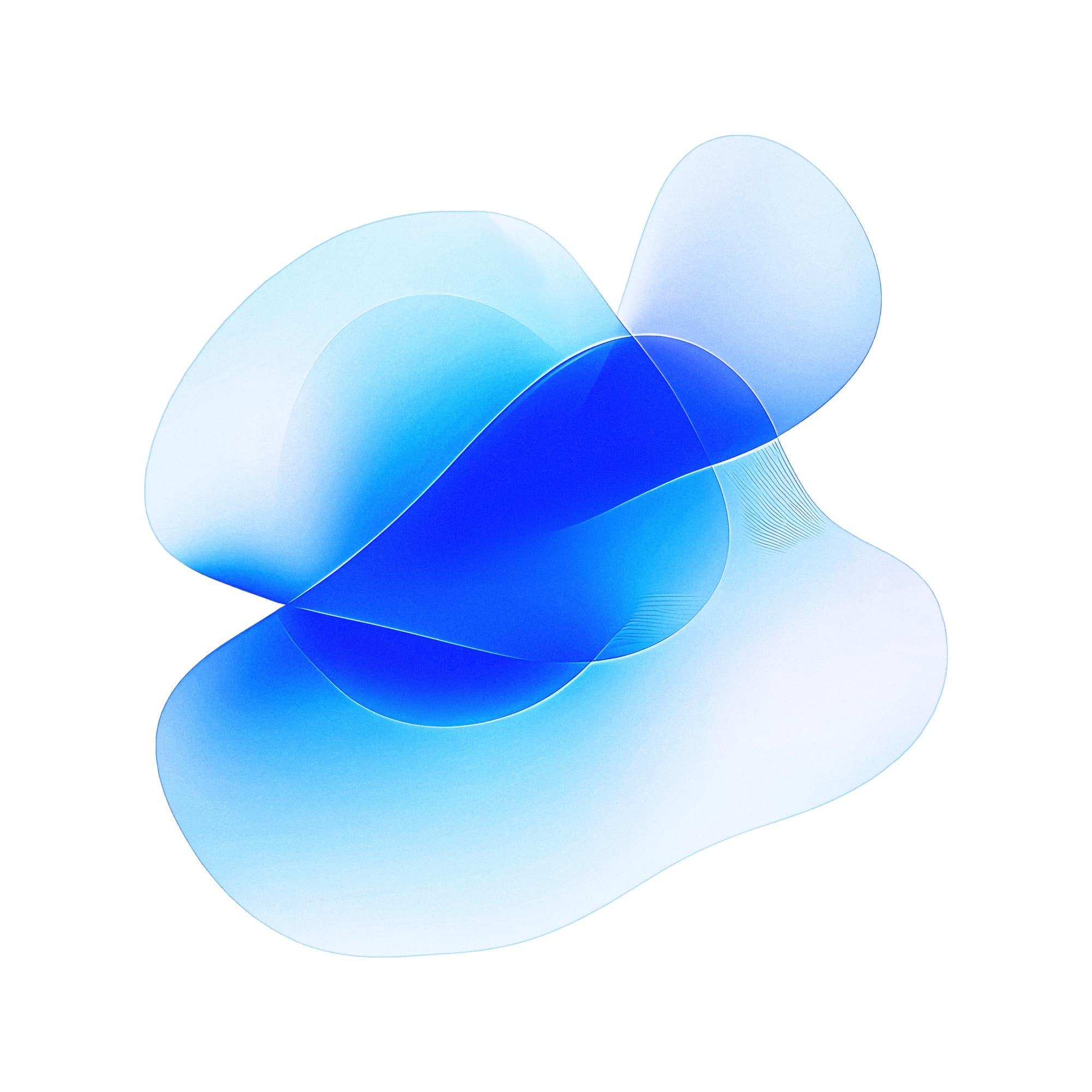
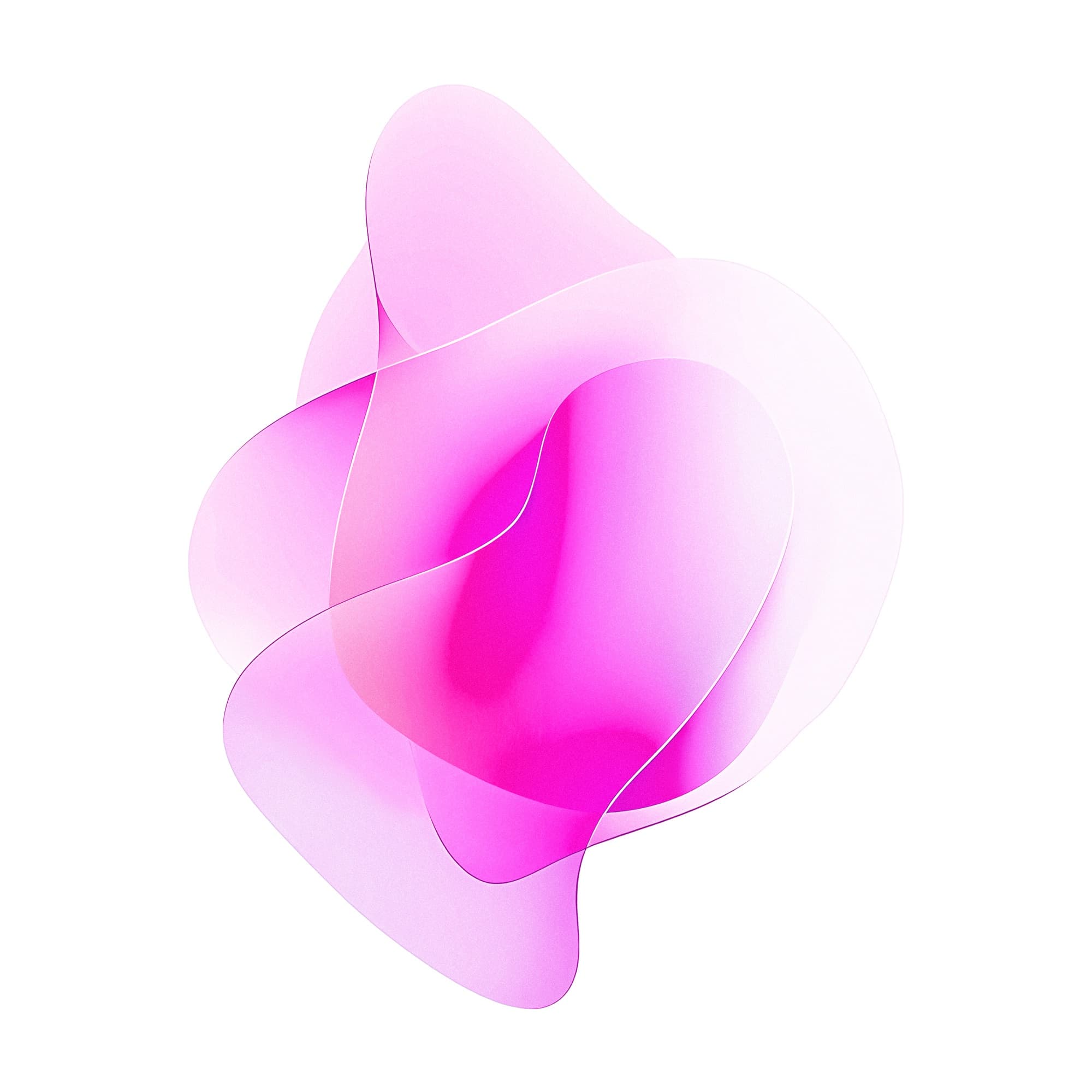
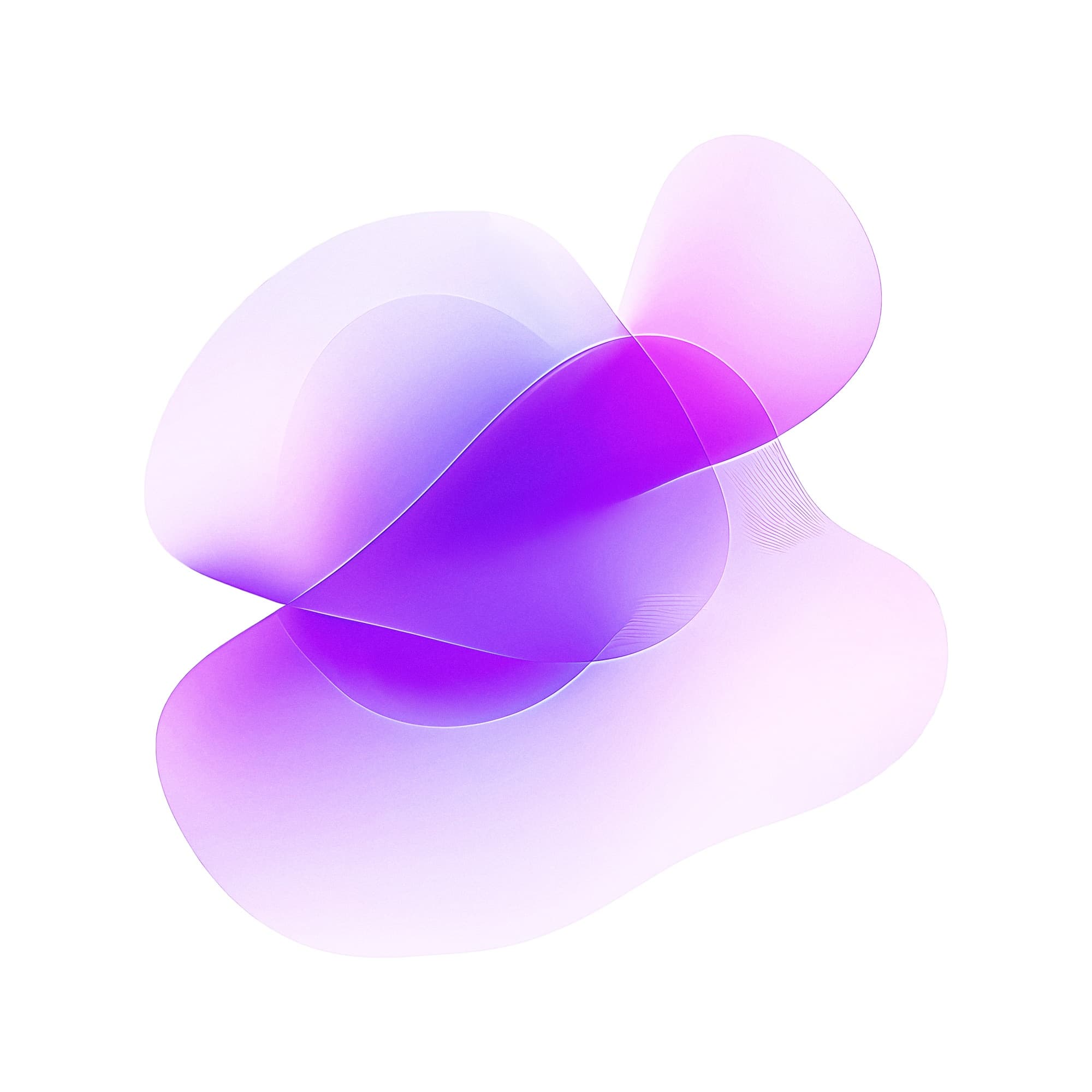
The Shapes of Life. Synapse's modules adapt to whatever software they land in: the shapes. Organic forms add biology and life, and became the central visual language: adaptability, personalization, living systems. The existing colours stayed, because the audit showed they were what people liked most.
Built to scale
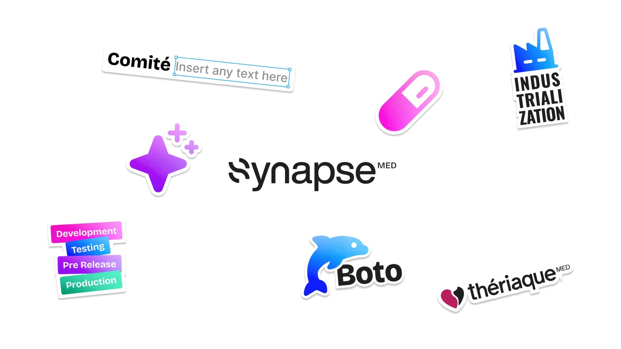
A structured colour logic lets the corporate brand and each product line coexist in one system, and a refined type pairing balances character and readability, scientific credibility and modernity. The identity had to carry AI-driven products, regulated medical content and very different audiences, from software partners to healthcare professionals, while staying unmistakably Synapse.
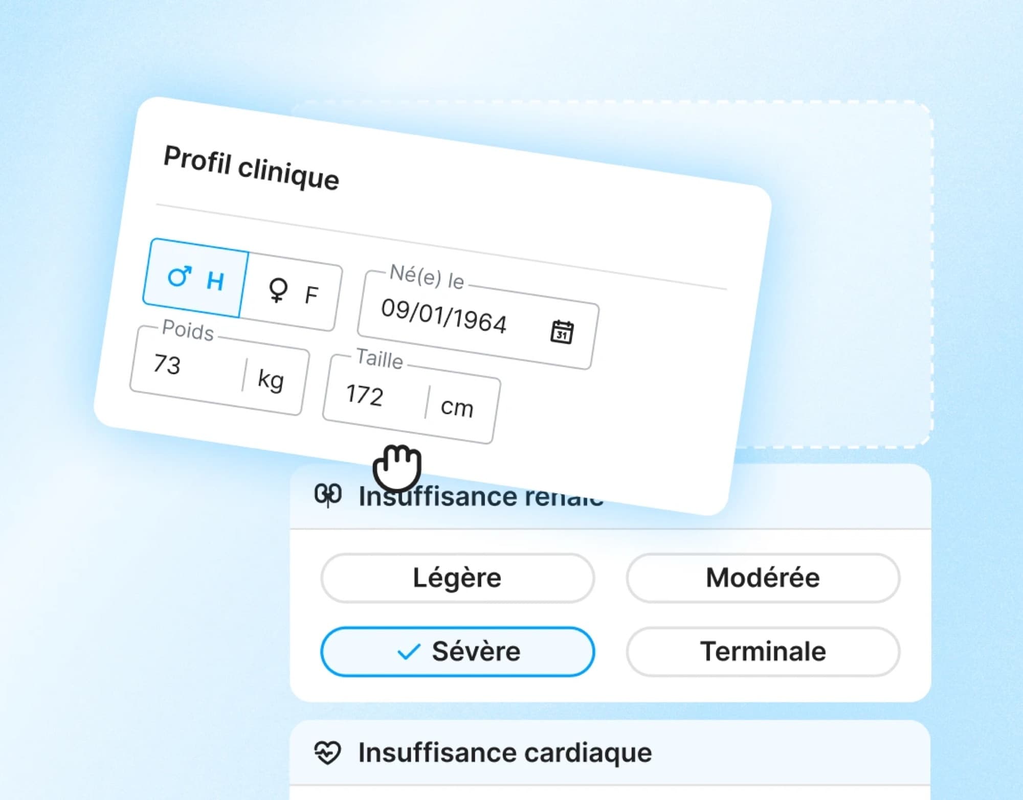
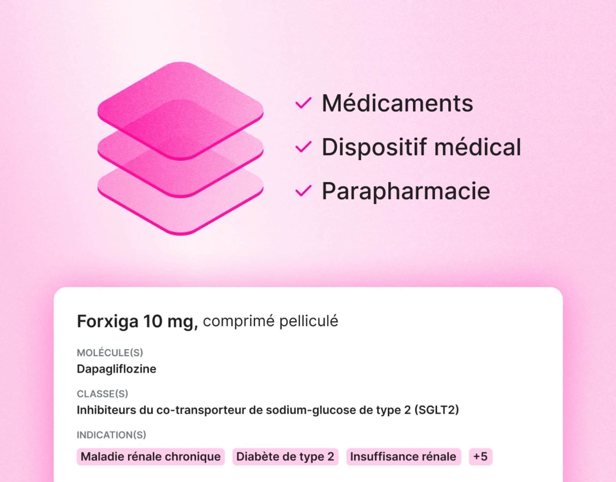
I turned the shapes into an architecture, one colour per product suite:
- Blue: Secure, all our widgets, certified medical device or not.
- Pink: Database, Thériaque.
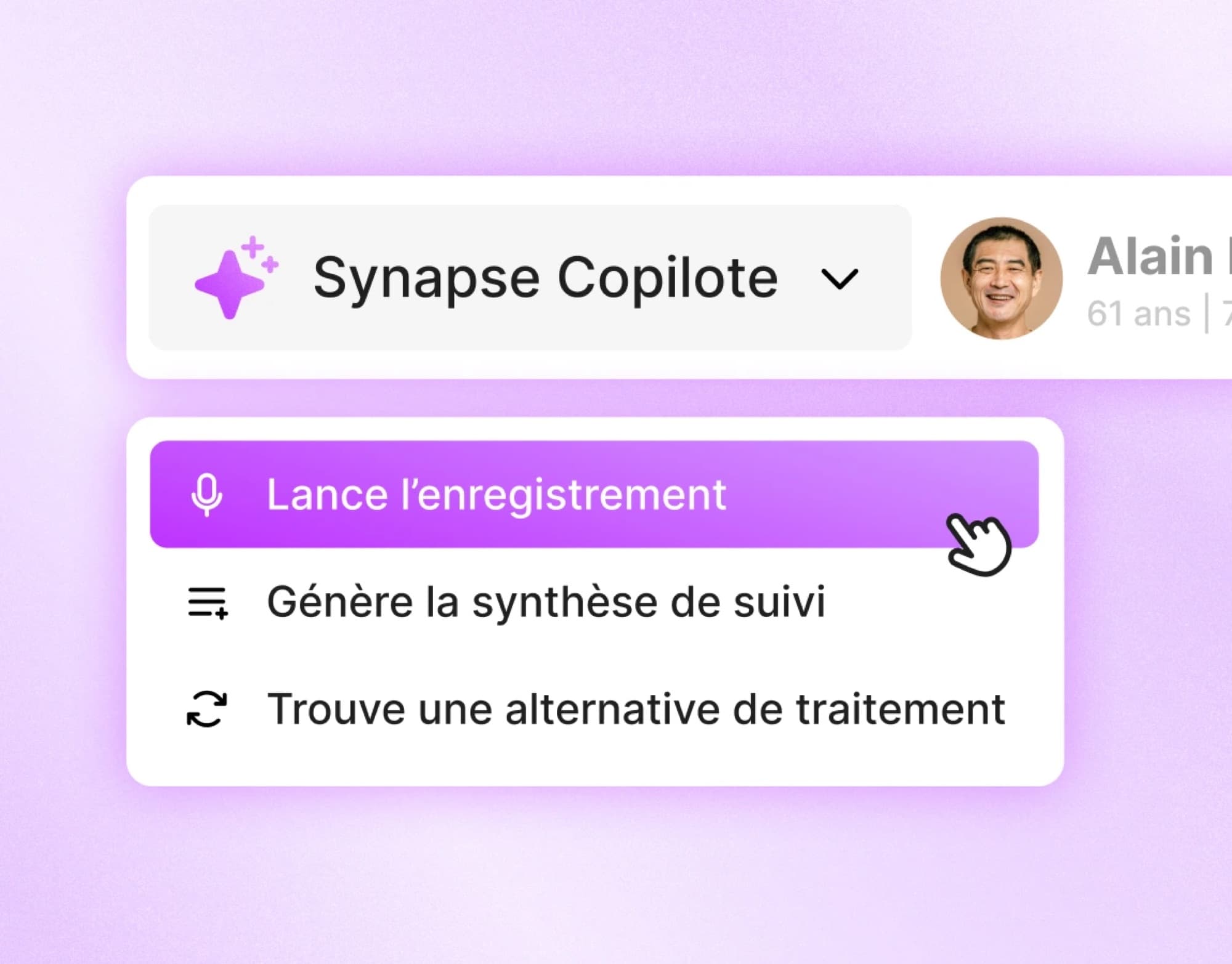
- Purple: Copilote, the AI widgets Follow, Audio and Ordo.
Rollout
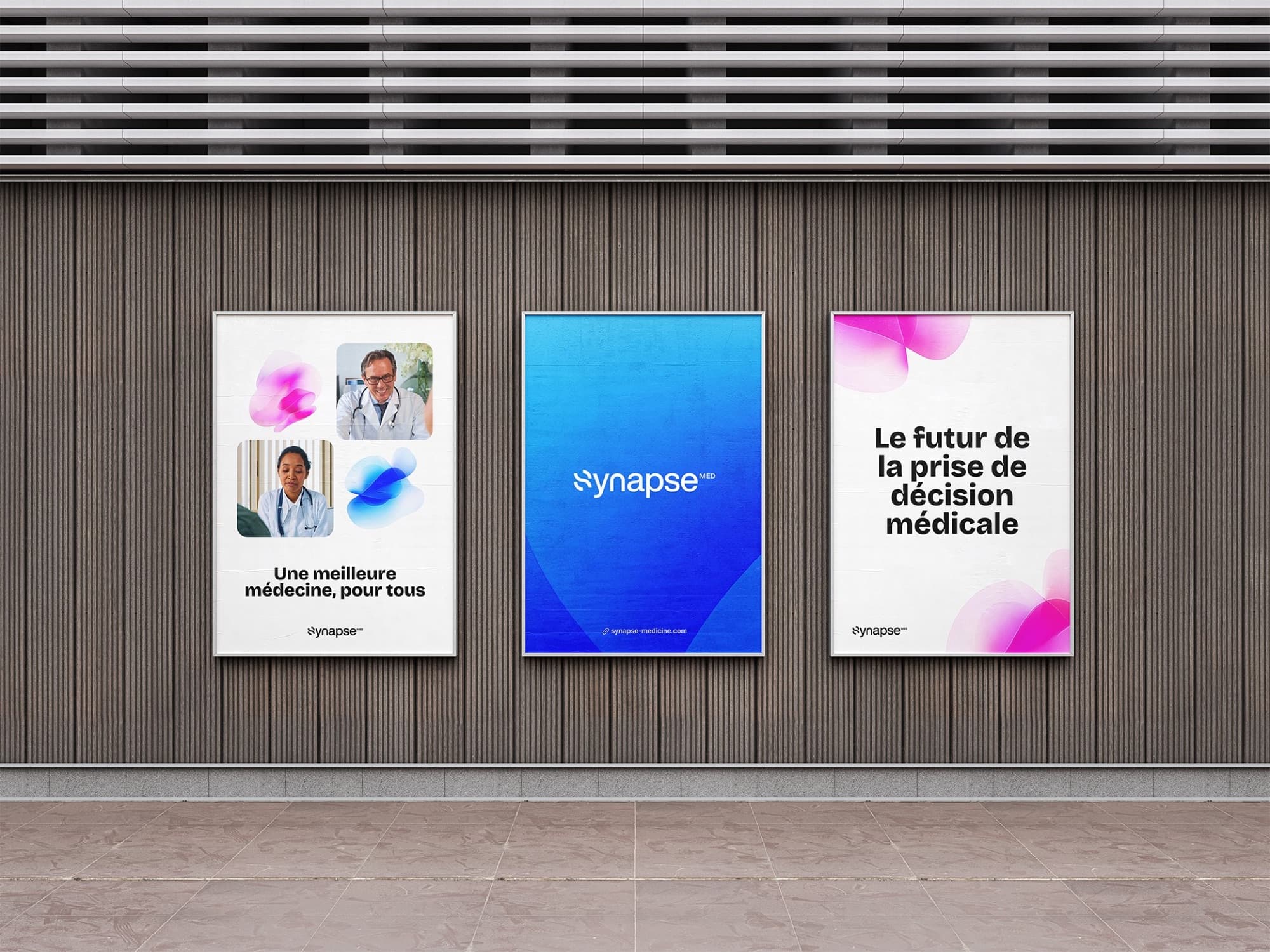
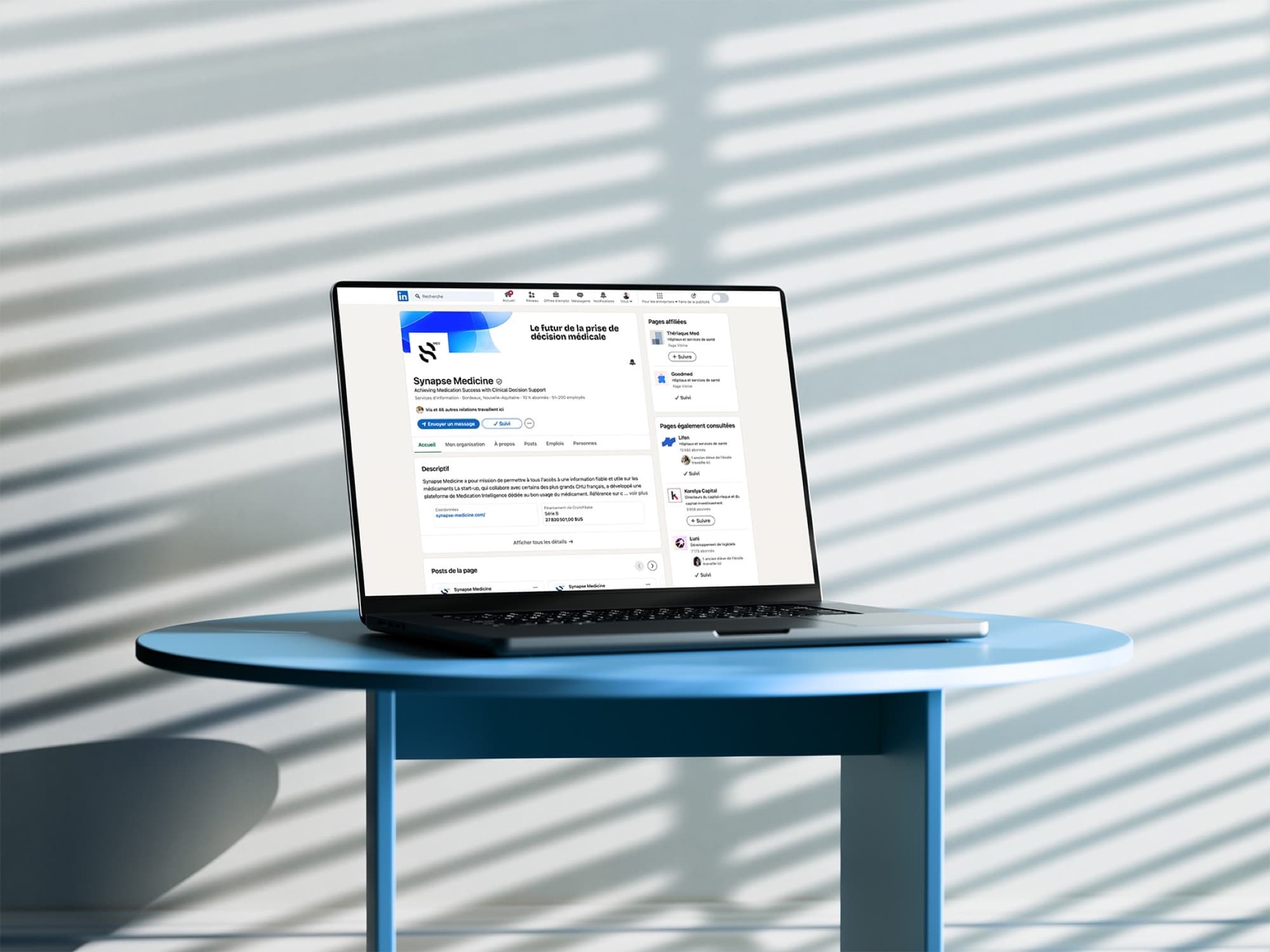
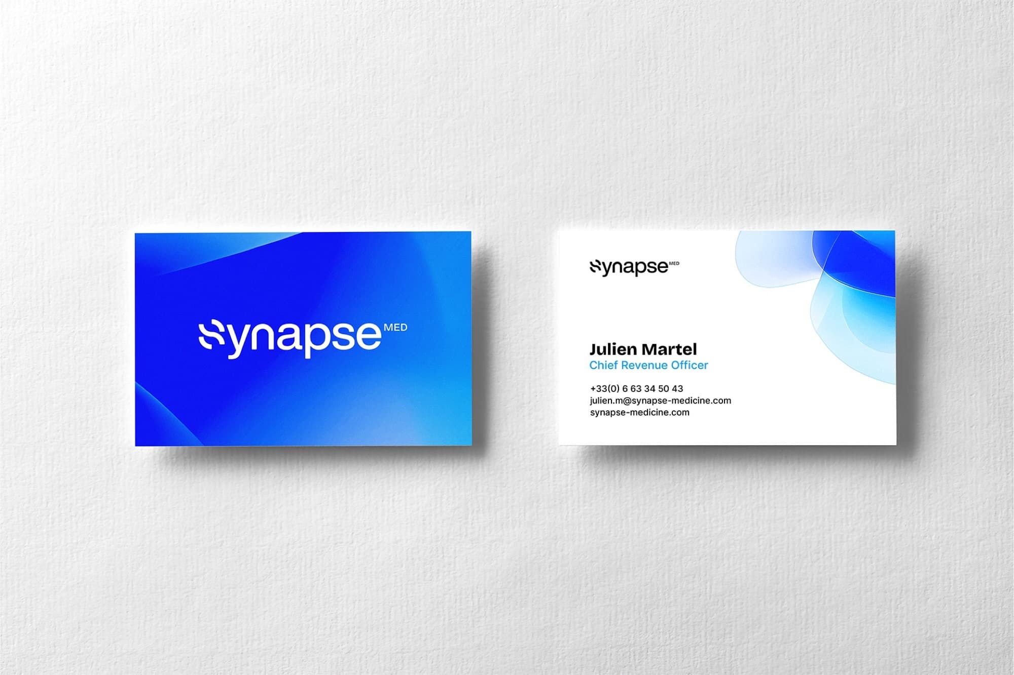
The new identity went out across every touchpoint: website, social media, product environments, events like Santexpo, videos, presentations and physical assets.
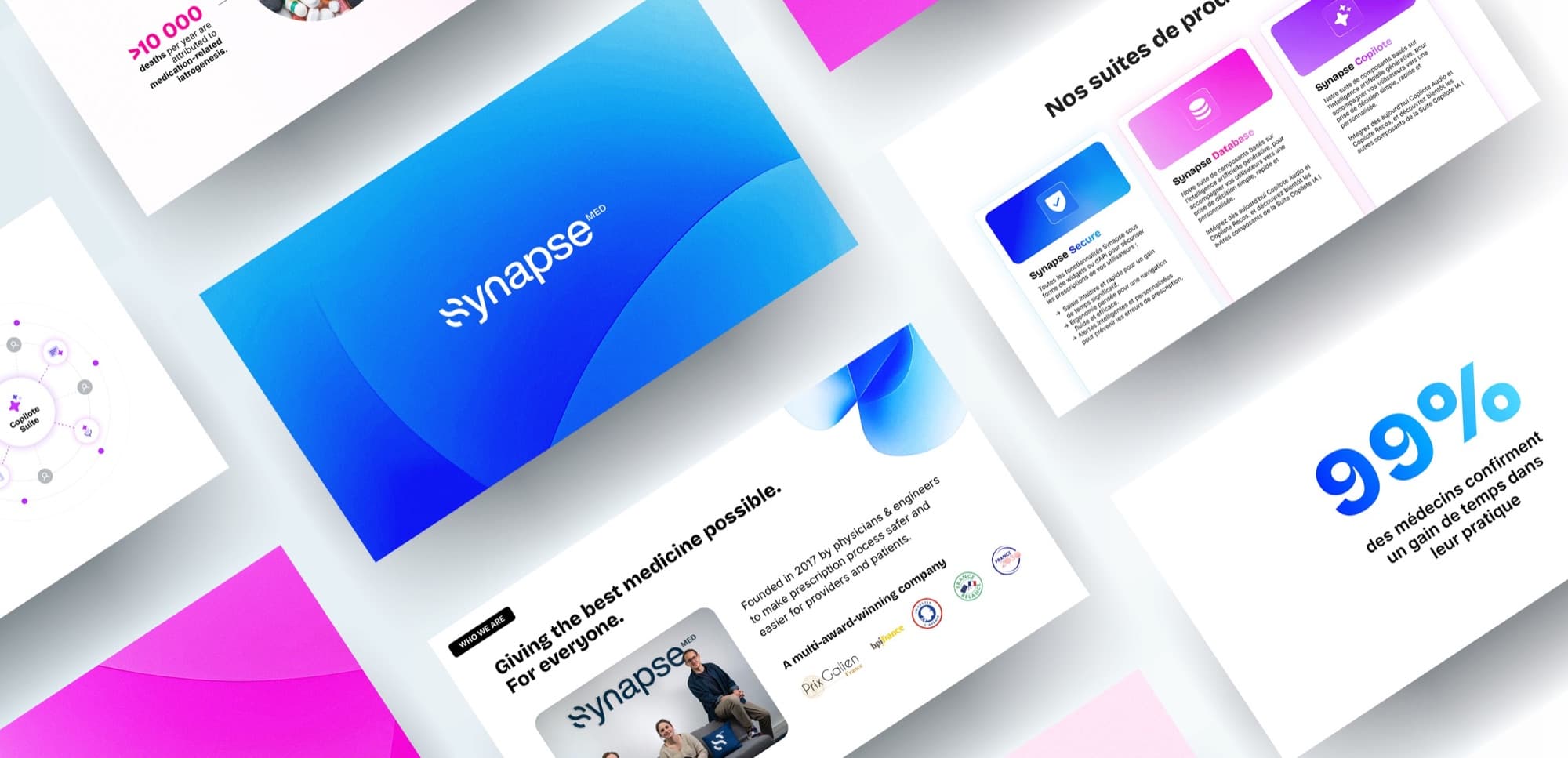
- Synapse's first brand book, in a full version (design and marketing) and a light one (press and partners), in Figma, Notion and Google Slides.
- Self-service tools so the everyday assets don't need a designer: a slide template built with Claude artifacts and an email-signature generator, used by the whole company (50 to 100 people).
- The website, top 10 pages, designed in Figma and built in Webflow; plus presentation templates, a 30-second brand video and all social assets.
Key results & takeaways
Synapse got its first brand book, 3 product suites with one colour each, and self-service tools used by the whole company, 50 to 100 people.
The slide generator alone: 50+ people have used it, with an average satisfaction of 5/5, and 100% of them say it saves time and is easier than starting from Google Slides.
The AI-generated shapes were hard to animate, and I'm not a 3D animator: I got there with Spline and Midjourney. Next time, motion comes first. A concept called The Shapes of Life should move from day one.
Even in highly regulated sectors, bold and thoughtful brand systems can create trust, differentiation and momentum.